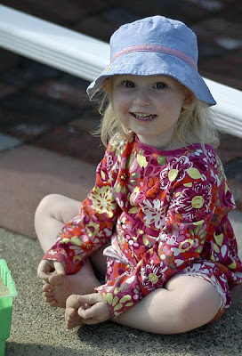
I have so many pictures I'm almost happy with, but feel like could be better. So I was really excited to hear about I Love Faces' Constructive Criticism Day!
Here's what I started with:
 And here's what I did with it:
I'm not happy about the drainpipe going through her head, but I'm not sure how much can be done about that. My biggest struggle at this moment is skin tone. I'd love suggestions on how to make that better! Any other suggestions on how to make this picture shine are MORE than welcome! :D
Thanks!
Details: Nikon D70s, f/1.8 1/4000sec ISO 200 50mm, edited using Adobe Camera RAW and PSCS3

4 comments:
What a cutie!!
I think the skin tone would benefit from a warming action or filter, like the one from Pioneer Woman (http://thepioneerwoman.com/photography/2008/04/actions/)... it really just needs a little bit of "ommphf!" behind it to start peaching up.
Alternatively, I might also use a selective color or vibrance adjustment layer to bring up the color saturation, and then mask out the areas I didn't want to effect.
Also, the drain pipe could be cloned out, very carefully, but it's one of those things that takes extra time and patience to really make it look natural.
skin tones are tricky. i make sure to get it as right in camera as possible, try using the presets for sun, cloudy, indoor lighting, etc. to get close. a color balance adjustment layer &/or using the hue/sat adjustment layer to remove any excessive reds(nikon)is helpful, but if you're shooting raw, you should be starting out with a much better file than a jpeg(overly saturated colors). i use a cmyk curve adjustment layer for more accurate skin tones. you can google to find tutorials on that. also, this photo would benefit a curves bump in the middle to lighten up, especially for the face. you may have to mask back other areas.
i agree that you can get rid of the gutter pipe, there is no simple fix, you can try the clone or patch tool, there are actually many different ways, but it will be the most time consuming part of the project!
http://i7.photobucket.com/albums/y286/NanasMama/DSC_2739edit.jpg
You can clone out the drain pipe :). This is just a quick edit. With a full resolution file and more time you could do a really good job. Just keep remembering to resample and not just try to "color" it out.
Next time you might try getting down on her level. Get all the way down on the ground and shoot so that the light is falling more on her face under the brim of the hat. Or even move her back on the other side of the drain pipe so that she's in the full shade. Then get that focus point right on her eyes. You should get some pretty good catchlights from the sunshine bouncing around outside the shade.
The other thing I would suggest is closing down your aperture just a tad. It's hard to get the focus right on at f/1.8. I'd suggest starting between f/2.8 and f/3.2 and working your way down to 1.8. Then you won't have to worry about maxing out your shutter, either.
This is a great shot! I like her expression and cute grasp on her toes. The butterfly pose!
Good luck on your journey!
Charlene,
This is a sweet, colorful picture! No wonder you want to hang on to it. As AJ pointed out, aside from the drainpipe, I would have gotten down on her level and shot directly at her. I think the recommendation on the aperture is a good one, too.
My edit can be found here:
http://www.flickr.com/photos/31335390@N02/3975481442/
As the file I started with was only 27kb, I know it looks very rough, but the general ideas remain. I opened it in Camera Raw, bumped exposure to +0.85, fill light to 6 and brightness to +4. Then I took it into PS CS3. I lassoed the whole subject, inverted, then adjusted the background with levels to darken it some. I deselected, then lassoed just the face. I used curves to brighten the face further.
I felt the green bucket was distracting and cropped the image vertically to cut that out. In order to keep her whole body in the frame, I need to clone in some more sand. After cloning for a while and "enlarging" her sandbox, I used the burn tool along the edges of the image.
I felt the image was too cool, as you mentioned, and the skin tone was grayish. I made a duplicate layer of the background then converted the blending mode to Soft Light, which helps pop the colors. I then reduced the opacity of the layer to 50%. I went to Layer>New Adjustment Layer>Photo Filter and used the Warming Filter (85). I reduced that layer's opacity to 50%. And that is all!
Thanks for letting me play!
Post a Comment